Challenge
How might we make gym-time effortless to encourage a healthy lifestyle for students?
Role
- UX Research, UX Design
Team
- Stephanie Niu
Methods
- Contextual inquiry
- Comparator analysis
- Usability testing
- Wireframing
- Rapid prototyping
- RITE testing
Deliverable
- Clickable prototype of an iOS app (Figma)
- Journey map
- Service blueprint
Outcome
Our findings and app, Sidekick, have been presented to the Stanford Rec & Wellness team with the intent of sharing a deeper understanding of the people who use Stanford's gym facilities.
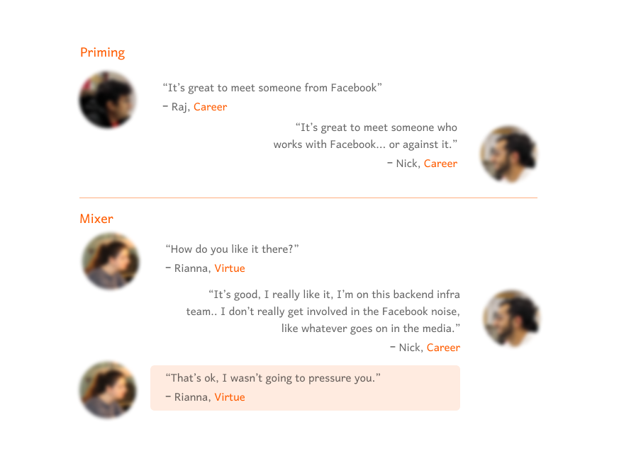
Step 1: Interviews and gym tours
We interviewed 9 people and learned that workouts are often cut short when equipment isn't available at the gym, but in fact we observed a lot of available equipment. So why do they cut their workouts short?
Gym users aren't willing to use machines that they don't know about.

Figure 1: Quotes from Stanford students and alumni from interviews
Step 2: Going from needs to insights
Why is asking for help at the gym so difficult? Our interviews led us to 2 key insights.
1. Gym-goers feel like they are disrupting others at the gym by asking for help.
2. Many gym-goers rely on "default workouts" to make working out easy, so creating a new routine when equipment is not available isn't an option.
What if we made asking for help an expected, explicit benefit of our service?
Step 3: Running usability tests with comparators
We were interested in exploring how existing digital solutions could inform our design, so we created a field guide for 3 usability studies of comparators to understand:
Do people prefer to select service providers or be given a recommendation? (Zocdoc)
How does a seller's profile impact a user's preference for communication method? (OfferUp)
How do people set expectations for a service? (Coffee Meets Bagel)
We had 3 key findings.
1. People prefer to choose rather than receive a recommendation, but they often only know "red flags" of what they're not looking for.
2. Filters help people understand what they want.
3. In service apps, the importance of a seller's profile vs the product depends on what users believe is being sold.
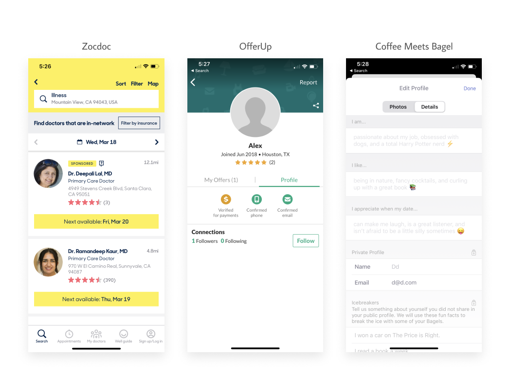
Figure 2: Screenshots of 3 existing services used to run a usability study understand how to develop our app's wireframe
Step 4: Testing paper prototypes
The results from our usability studies led us to develop 2 wireframe options for how a user selected a gym buddy. To design this task, we needed to understand:
1. Do our users perceive the trainer or the workout as the product of our service?
2. What information people do people use to make their decision? Does this belong on the main browser or a filter?
We ran an A/B test with three student gym users on 2 wireframe options: a workout browser and a trainer browser.
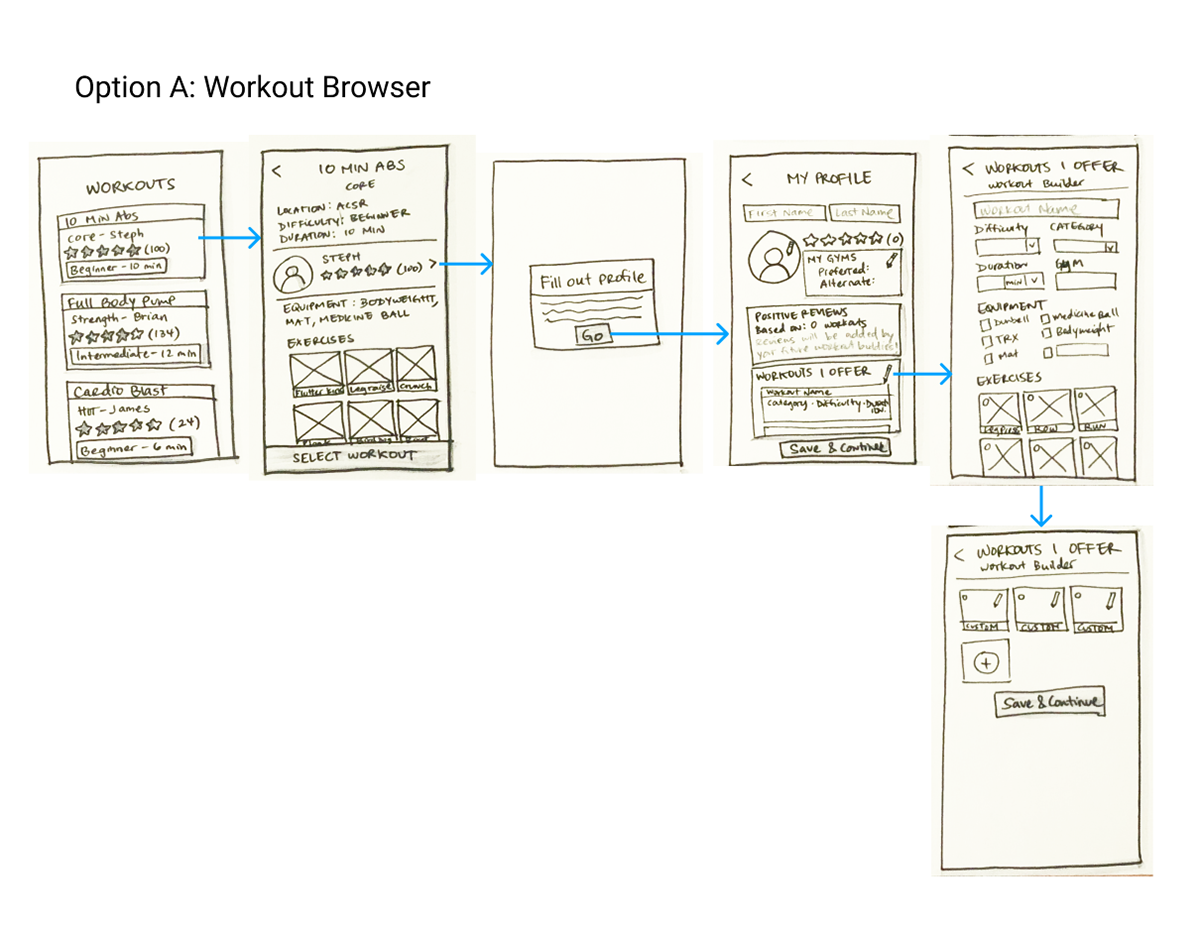
Figure 3a: Option A wireframe for A/B testing framed the product as the workout
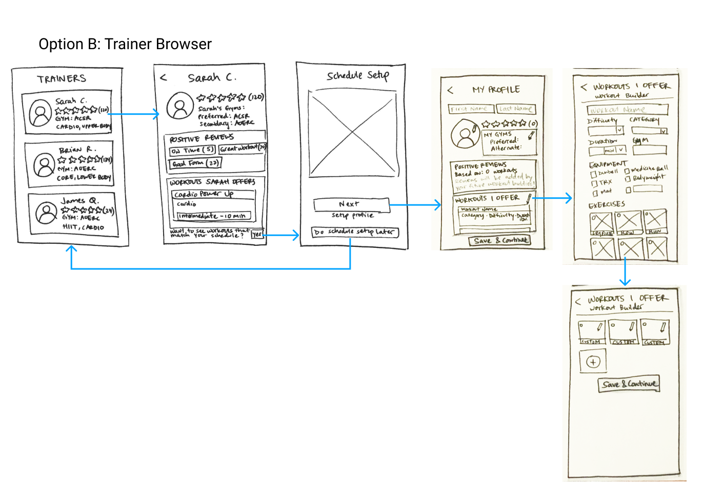
Figure 3b: Option B wireframe for A/B testing framed the product as the trainer
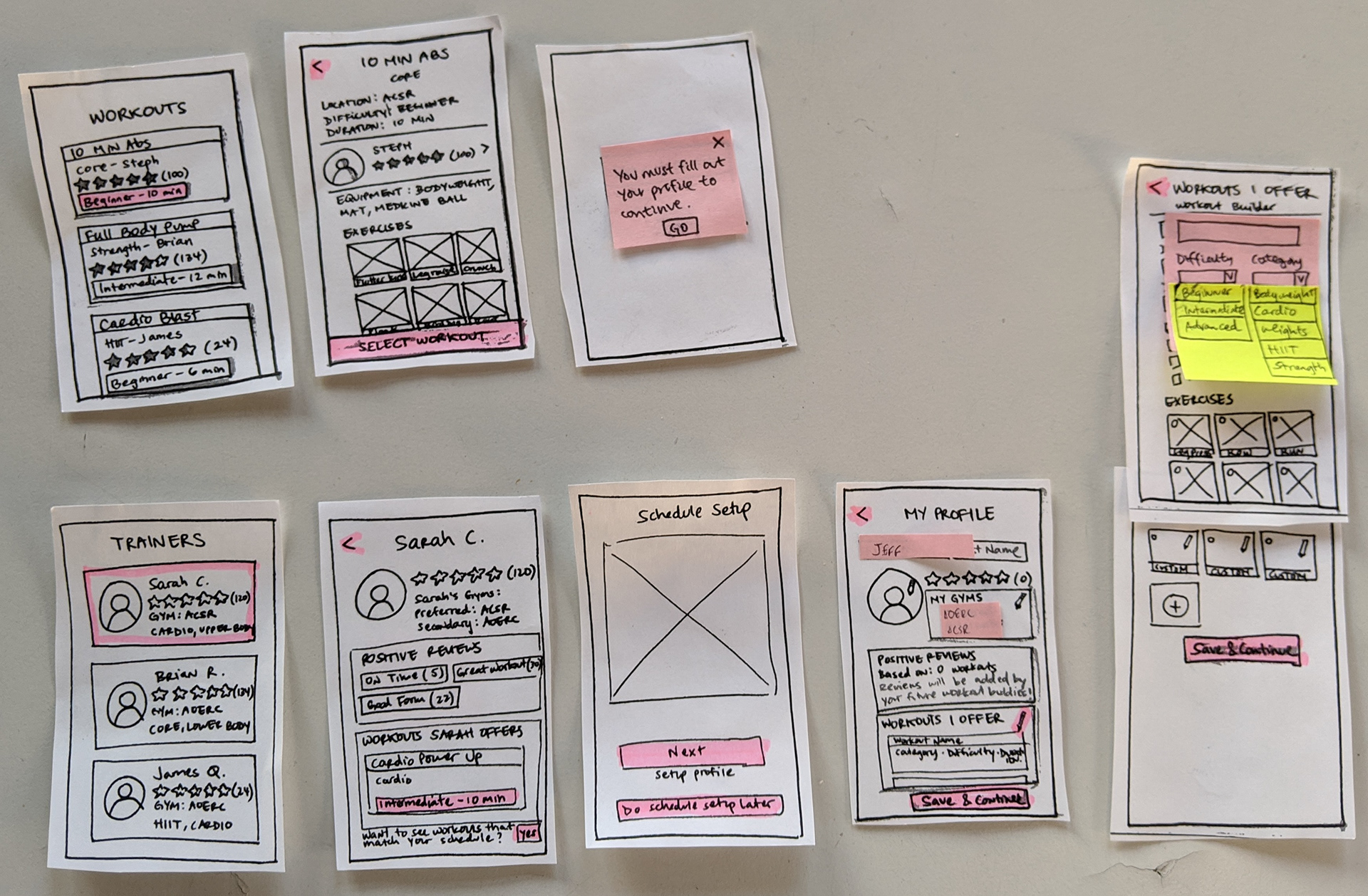
Figure 4: Paper prototypes of the option A and B wireframes
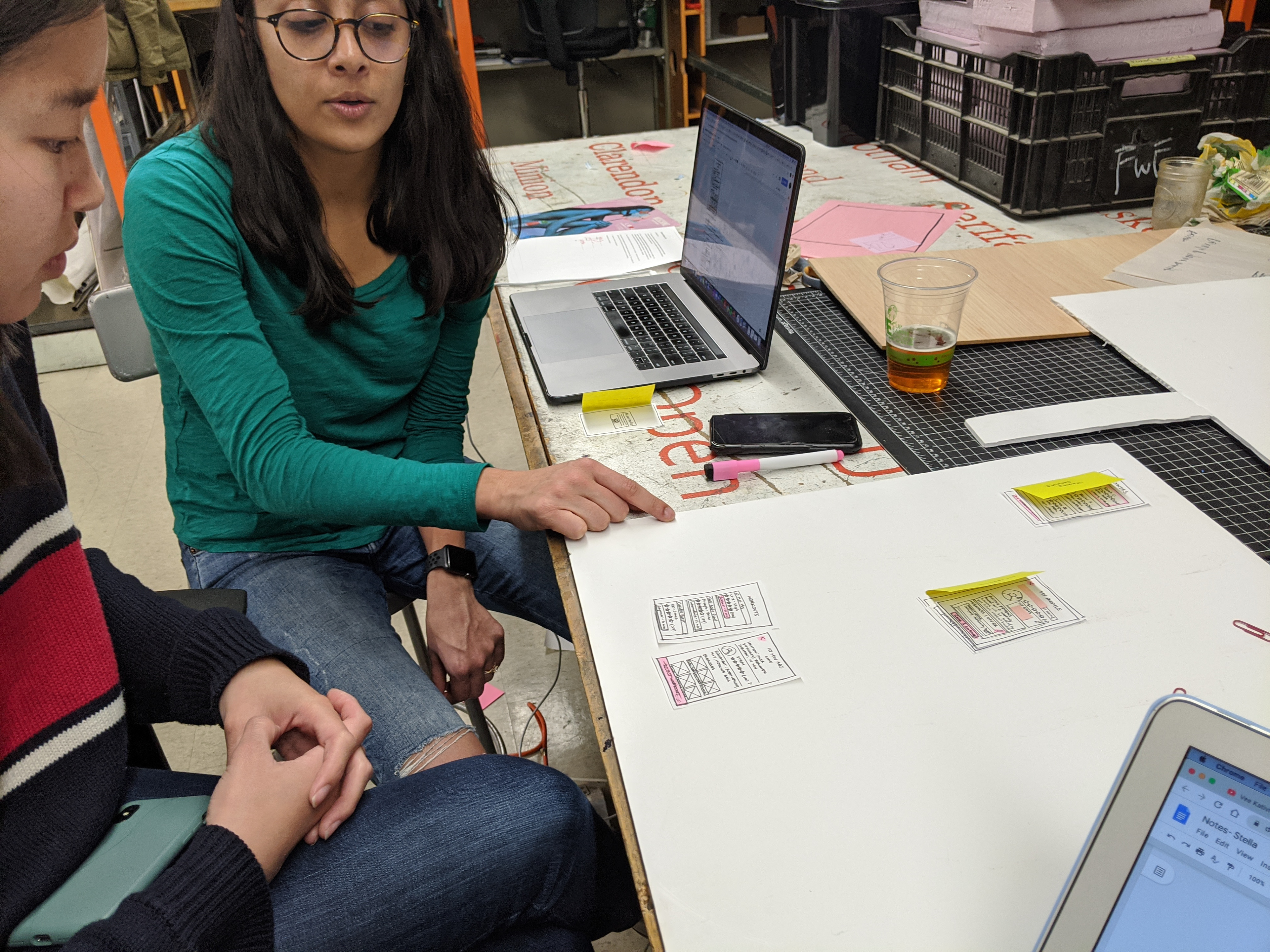
Figure 5a: A/B testing the paper prototypes with users
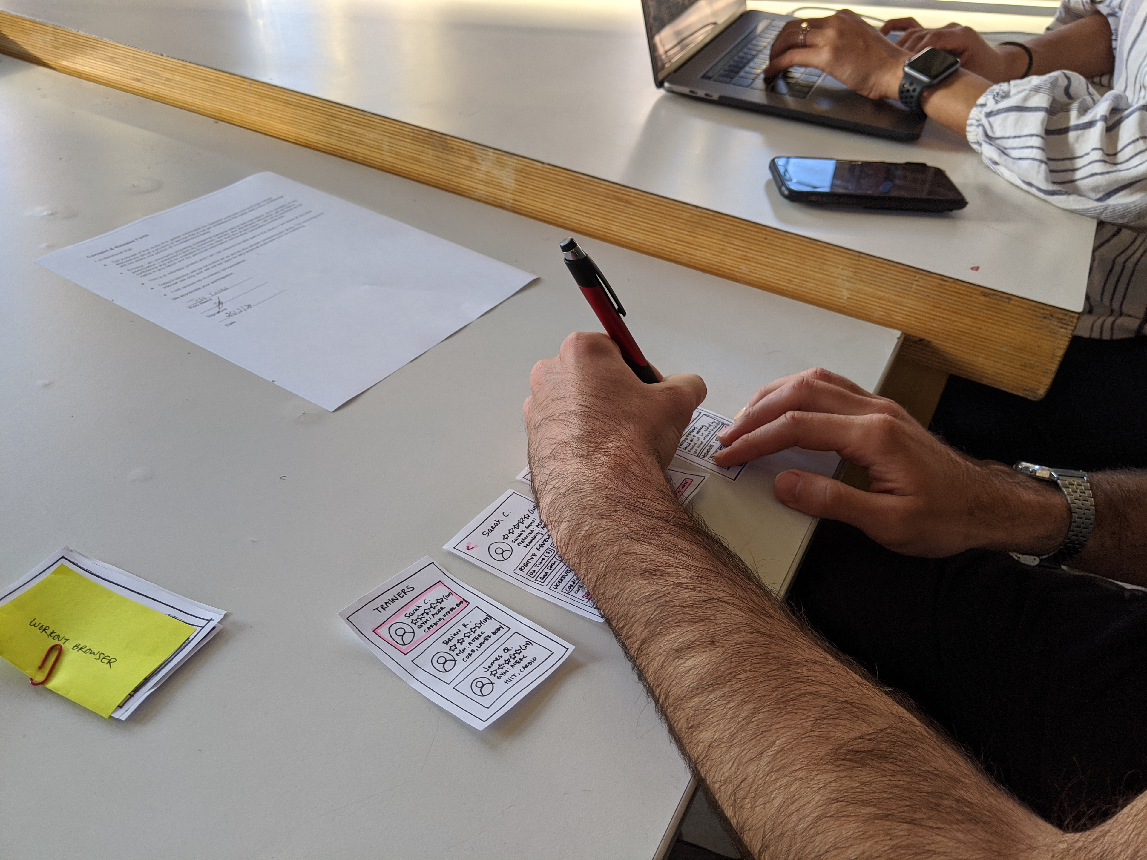
Figure 5b: A/B testing the paper prototypes with users
We found that our users thought that the person they workout with was more important than the workout itself.
What we called that person was equally important.
People had different mental models of who this person could be - a trainer, a friend, or an acquaintance - and each served distinct purposes.
We chose to move forward with the 'acquaintance' model since our users valued the accountability of working out with someone. However, we renamed them as 'buddies,' hoping to embed elements of personality and trust into their profile cards and the interactions needed to connect with them.
Introducing: Gym Buddies.
Step 5: RITE Testing to go from low to high-fidelity prototypes
By simultaneously testing and iterating on our design on 6 participants, we were able to maximize the feedback on our design changes in a 1-week sprint.
Researching common patterns gave us a basis for UI elements and interactions. More details on how our test results informed the design can be found here.
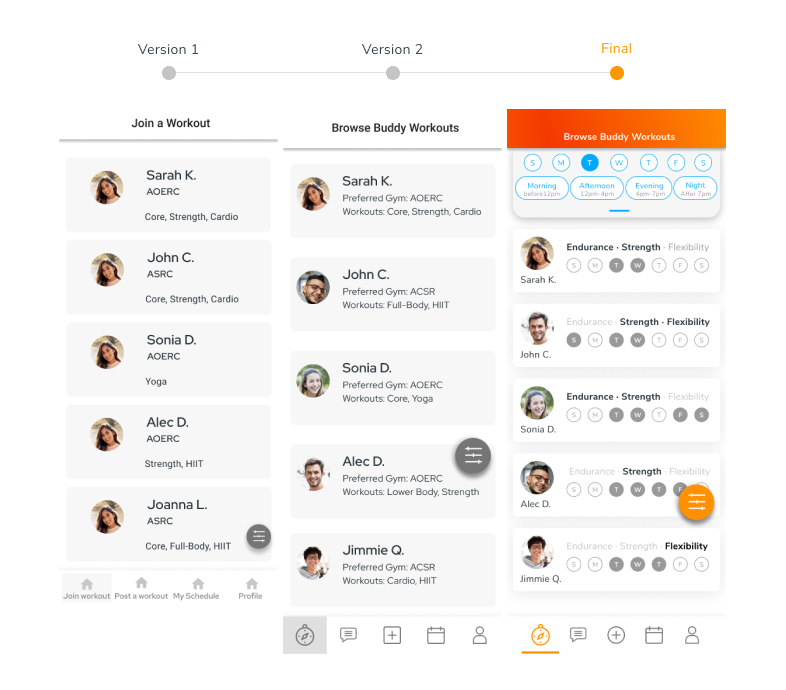
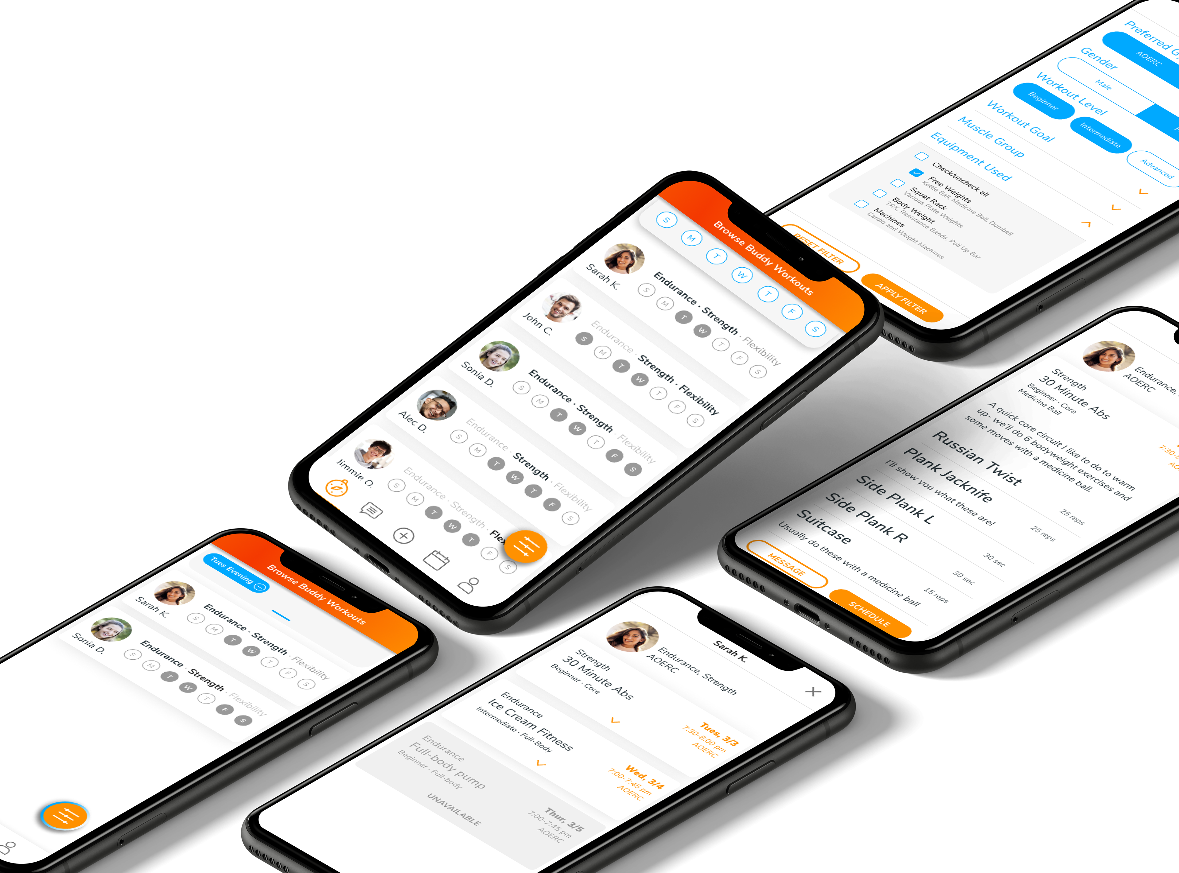
Figure 6: Design progression of home screen from black and white digital prototype to a branded, interactive digital prototype on Figma.
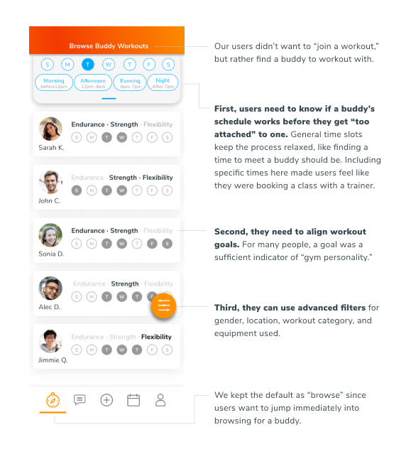
Figure 7: Feedback from RITE testing that impacted the final design.
Step 6: Creating a design language that reflects gym-users' goals
Through our interviews, usability studies, paper prototypes, and RITE testing our digital mockups, we learned that when students look for a gym buddy, they're looking for someone to keep them motivated and accountable. They're also looking for a process that is easy. With the stress of school, figuring out logistics around workouts is the last thing they want to worry about.
Check out the full style tile here.
To reflect our users' goals, I created a design language around these 4 words: energized, high-spirited, camaraderie, and easy.
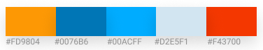
Figure 8: Color palette used for Sidekick
Meet Sidekick.
Learn new workouts by following a buddy's routine.
With Sidekick, Jenny can still follow along a routine, but she now has someone to teach her how to use new equipment to strengthen her core. Most importantly, with a gym buddy explicitly designated to help her, she doesn't have to feel like she's violating a social norm to ask for help.