Challenge
How might we improve a lab instrument's first-time use in order to minimize onsite support during product launch?
Company
Miroculus
Role
User Research, UX Design, Mechanical Engineering
Team
- Severine Margeridon (Senior Manager, Assay Development)
- Carrie Haverton (Senior Director, Product Marketing)
- Morgan Watson (Head of Systems Integration)
Methods
- Stakeholder analysis
- User interviews
- Wireframing
- Usability studies (Illustrator, Qualtrics, Asana)
Deliverables
- Personas
- Quick Start Guide
- Journey Map (Figma)
- Information Architecture
Outcome
With the results from my study, the hardware and software team had a prioritized list of feature improvements to focus on prior to the beta launch in September 2019.
More importantly, I introduced the team to the power of human-centered design. By engaging my stakeholders as observers throughout the usability study, I was able to convince management of the value of early testing with real users.
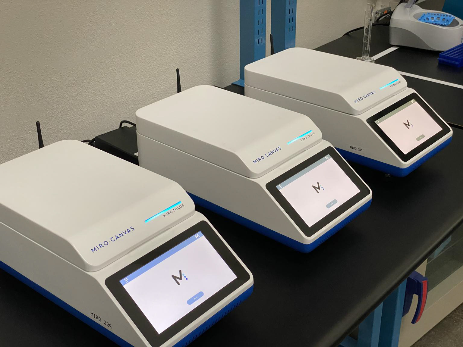
Note: Due to an NDA, the case study provided below will only speak to my process and not the actual content of work done. All images used are publicly available online.
Formulating the research question
To scope the research plan and to align the stakeholders, I first held 1:1 meetings with the involved team leads (science, integration, hardware, software) to better understand the questions and concerns that each group was interested in addressing, and to identify the core business need as a North Star for our study. I compiled all previous studies done on the instrument as well as all relevant internal documentation, such as the company's competitive analysis and system trace matrix with marketing requirements. As a new employee and sole designer at the start-up, I wanted to ensure that my research plan was well aligned with their existing way of working in agile, and I wanted my team to feel confident in the research plan given their role would eventually be to implement changes from our findings. Finally, I conducted secondary research alongside my synthesis of the core concerns from the team leads.
With this background work, I was able to develop a categorized list of questions, assumptions, and facts that helped to identify where our gaps in knowledge were as well as what seemed to be the core concerns of the team leads. In a workshop with the team leads, we refined my proposed research question with specific goals so that we could ensure alignment from the start of the study.
How might we improve first-time use in order to minimize onsite support during product launch?
Defining our users
In my 1:1 meetings with the leads, I probed to understand motivations and pain points of the users. With this information, the integration lead and I created a persona map showing the interactions of the various stakeholders, as it was important to communicate to the team that the end user for this instrument was not the one responsible for purchasing decision. The information provided from the leads also helped me to define proto-personas, a summary of what our team thought our users were like. My decision to start with a proto-persona was an intentional one; in working with the existing agile infrastructure, I knew a more thorough ethnography would not be appropriate for this project given our short deadline and minimal funding. Additionally, we already had baseline information to work with from prior marketing research. Our plan was to validate our proto-personas with data from the usability study. I used these proto-personas to create criteria for our usability study participants and to develop a screener on Qualtrics.
Designing the usability study: methods
Since the team used an Excel trace matrix to organize their high-level marketing requirements to low-level product specifications, I decided to organize the usability study methods in a similar, familiar form (see below). This helped us to align the high level business goal to each individual task in the study.
Following the Nielson Norman methodology, I was able to write a set of user scenarios for our study following the below steps:
1. Create a full list of user tasks and prioritize the top tasks with the integration lead.
2. Use data from my categorized list of questions, assumptions, and facts to determine the system aspects that stakeholders are most concerned about.
3. Rank questions by importance to users and organization with support from team leads.
4. Create specific problem statements for each of the 3 top questions.
5. Develop research goals for each problem statement.
6. List participant activities and behaviors needed to observe in order to address each research goal.
7. Align top user tasks with these activities/behaviors to identify the required tasks to observe in the study.
8. Create scenarios based on top user tasks identified.
Next, for each research goal, I worked with the team leads to specify a hypothesis and a metric for success.
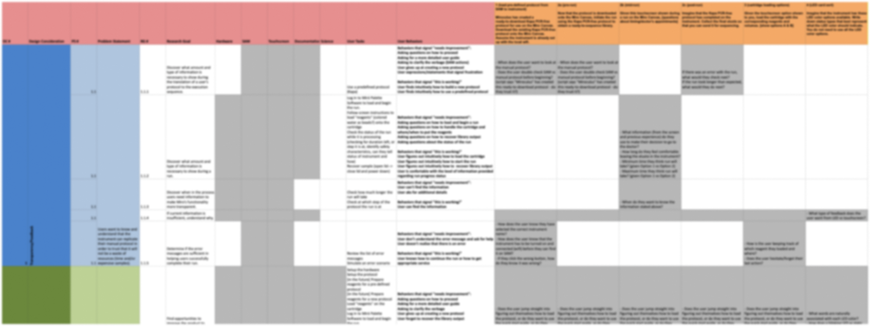
Figure 1: A trace matrix outlining how the business goal aligns with the research goals, hypotheses, scenarios, and tasks
Designing the usability study: materials
This part of the process required the most creativity as the product was not fully functional at the time of the study. Since Miroculus is a small start-up, I not only functioned as the design lead for this study but I was also assisting the mechanical engineering team troubleshoot design issues and design test fixtures. Due to my technical experience with product functionality, I was able to create a demo workflow with product development constraints through 'wizard of oz' prototyping. My workflow mapped out each scenario to a user task, user interface, and script architecture that was required for the product to perform specific actions. With the incredible help of the software and integration teams, we were able to pilot test this workflow and associated materials with our internal science team to ensure the usability tests the following week would run smoothly.
Materials I created specifically for this study:
- a draft of the Quick Start guide
- wireframes for touchscreens
Conducting the study with 5 participants
Prior to running the study, I led a kickoff meeting with our team leads to prepare them for how the study would be run. I assigned roles for each member (videographer/photographer, note-taker, moderator), limiting the team to 2 observers and 1 moderator per participant. I intentionally wanted several different stakeholders to observe each participant to ensure buy-in and reduce the mount of time required to communicate and document findings later on.
As the sole designer on the team, I created a note-taking guide to help educate stakeholders on good practices, and to ensure an efficient debrief. I planned to have a 1-hour debrief after each participant in order to document high-level takeaways as well as a paper journey map while the data was fresh in our minds.
The most exciting part of running this study was to see the genuine engagement of the stakeholders during the debrief. I worked to ensure the team separated fact (things the user said and did) from belief (things we believe the think/felt) in this process. The team heard the users say unexpected things and behave in unexpected ways - a validating moment for the need to invest the time and energy for this usability study!
Synthesizing over 400 data points
I converted our findings to Airtable so that I could cluster the data points around patterns, journey map stage, as well as expected location of information - all necessary for my formal study deliverables. I was able to separate out data that was representative of specific issues that need to be addressed, versus data representative of the larger needs of our users.
Coming up with solutions and making design decisions
I presented this data to two audiences, each with a different purpose:
1. Audience: Executive team (Chief Executive Officer, Chief Technology Office, Chief Science Officer, and Chief Marketing Officer)
For this audience, I presented the findings in the form of a journey map to help them visualize the relative priority of each finding. The map (below) also included a high level information architecture mapping to show where our users tended to expect instructional information to reside. The map also included a bar chart to show frequency of each finding. I shared several video clips of our users in their most frustrating moments to supplement the severity indicated on the map. As this was the end of my internship, my goal was to provide the executive team the information they needed to move forward with prioritizing tasks for their functional leads.
2. Audience: Full company staff (30 employees) as a design workshop.
For this audience, my goal was to host an interactive workshop where teams could start brainstorming and prototyping ways to move forward. In the first half of the session, I presented the major findings from the journey map as well as the video clips to help the wider team build empathy with their users, but I also spoke to the larger needs (and updated proto-personas) that our usability study findings uncovered. My hope was to create a source of truth for all teams to revert to as they develop the product. In the second half, I led a brainstorming and prototyping workshop where we had cross-functional teams collaborate on solutions. With my previous experience developing curriculum and instructing design thinking workshops, I had a plethora of tools that made for a successful workshop with my colleagues.
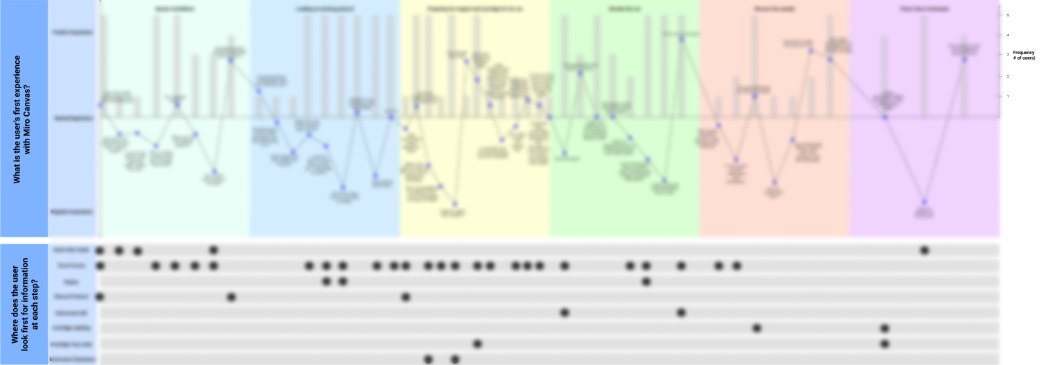
Figure 2: A journey map and information architecture diagram showing where users expect information at first-time use
Impact
Though I was not able to physically witness the progress the team has made with findings from the study in my 2-month internship, my team thanked me for the direction I was able to provide them in moving forward. I was able to ground their decisions to prioritize amidst limited resources. Moreover, the test fixture I designed with the engineering team is currently being used to help capture costly failures early in the process. Below is a comment from my mentor and Head of System Integration:
“When the entire mechanical engineering staff was out at a vendor site, Tulsi stepped in to learn, do, and fix. This blended hands on and analytical approach meant that Tulsi became an expert on our system in a short amount of time. Tulsi was then able to confidently speak for the design during a usability research study that she led from start to finish. She ensured that all stakeholders had a voice so that only the right questions were answered.”
- Morgan Watson, Head of System Integration
- Morgan Watson, Head of System Integration
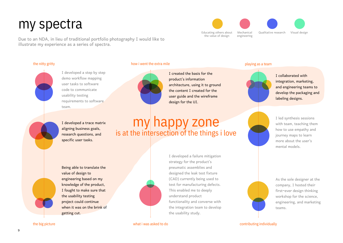
What I am most proud of
The below infographic is my personal reflection of my time at Miroculus. Coming from a large corporate culture of over 100k employees at Schlumberger, the start-up world can often feel overwhelming with the number of hats needed to be worn to get a product shipped. For me, I believe my ability to leverage all my skills and interests allowed me to excel as a designer working in my own craft. I hope this diagram provides some insight into my moments of joy in these 2 months.